Back to projects
Strategy advisory · Corporate website

Creating a lasting value for private equities.

A twelve-screen website for Renaissance Advisory Services, a London strategy and deal value advisory firm. Four marketing pages, an insights library with three content templates, and the system states that hold it together.

Client
Renaissance Advisory Services Ltd.
Sector
Strategy & deal value advisory
Role
UX/UI Designer
Year
2022
Scope
12 screens · IA · design system
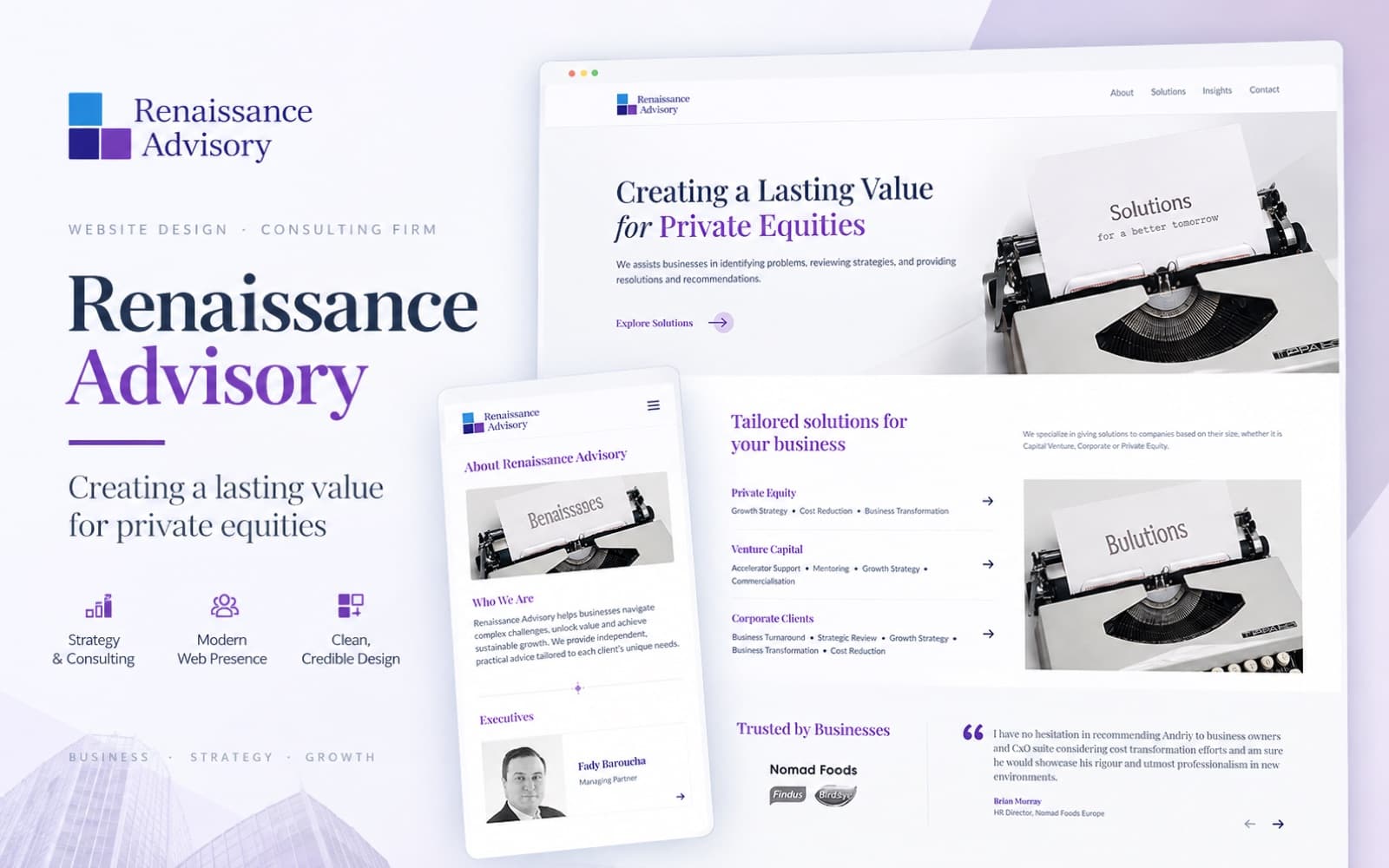
Renaissance Advisory website design — desktop and mobile
Overview

The brief.

About the client

Founded in 2016, Renaissance Advisory Services is a multi-service strategy and deal value advisory firm working at the front of the CxO agenda for private equity, venture capital and corporate clients.

The problem

The firm had no website to point prospects at. Credibility in advisory is carried by proof — named executives, real client outcomes, a clear service catalogue — and none of it was available to anyone researching the firm.

The goal

Build the site around two jobs: let a prospective client find the right service and make contact in a few steps, and give the firm a publishing home for articles, case studies and video that keeps proving expertise.

12
Screens designed
3
Client types served
3
Insight content templates
1
Contact route, repeated everywhere

Collaborators

Andriy Panasenko
Co-Founder / CEO — client lead
Front-end developer
Build and CMS integration
Mariam AbdElaty
UX/UI design — end to end
Information Architecture

Four nav pages, five templates.

About, Solutions, Insights and Contact carry the marketing story. Five templates sit beneath them — a solution detail, three insight layouts and a team member profile — plus the two system states. Header, contact band and footer stay constant across all twelve screens.

Root
renaissance-advisory

Primary nav

  • Home

    • Hero
    • Solutions
    • Clients
    • Testimonials
    • Insights
  • About

    • Story
    • Vision
    • Mission
    • Values
    • Executives
  • Solutions

    • Private equity
    • Venture capital
    • Corporate
  • Insights

    • Index
    • Type filter
  • Contact

    • Form
    • Firm details

Templates

  • Solution detail

    • Scope
    • Approach
    • Related
  • Article

    • Standfirst
    • Body
    • Author
  • Case study

    • Situation
    • Work
    • Outcome
  • Video

    • Player
    • Summary
    • Transcript
  • Team member

    • Bio
    • Focus
    • Contact

System states

  • Empty state

    • Reason
    • Reset filter
  • 404

    • Message
    • Nav out

Global

  • Header

    • Logo
    • Nav
    • Active state
  • Contact band

    • Headline
    • Note
    • CTA
  • Footer

    • Logo
    • Nav
    • Copyright
Foundations

Typography

A serif display face carries every heading and the Contact Us call to action; a humanist sans carries body copy, form labels and navigation.

Headings · CTARegular · Semibold · Bold
Serif display
ABCDEFGHIJKLMNOPQRSTUVWXYZ
abcdefghijklmnopqrstuvwxyz

0123456789 & ! ? @ # % ( )
Body · UI · FormsRegular · Medium · Bold
Humanist sans
ABCDEFGHIJKLMNOPQRSTUVWXYZ
abcdefghijklmnopqrstuvwxyz

0123456789 & ! ? @ # % ( )
Text styles · DesktopEight styles
Display — page title
Serif, Regular, 44px / 52px, tracking -0.01em
Header 1 — section
Serif, Semibold, 36px / 46px
Header 2 — card title
Serif, Semibold, 24px / 32px
Header 3 — service name
Serif, Regular, 20px / 28px
Quote — testimonial
Serif, Regular, 20px / 32px
Body 1 — paragraph
Sans, Regular, 16px / 26px
Body 2 — supporting copy
Sans, Regular, 14px / 22px
Label — type & read time
Sans, Medium, 12px / 16px, tracking 0.04em
Foundations

Color system

The violet from the mark does the heading and link work. Indigo and sky blue — the other two squares in the logo — hold structure and highlights, with paper, ink and status ramps covering surfaces, type and feedback.

  • Primary
    Violet
    #8156C0
    #F6F2FC50
    #EADFF8100
    #D6C2F0200
    #BC9DE4300
    #A57FD6400
    #8156C0500
    #6B44A4600
    #553487700
    #3F2666800
    #2A1844900
  • Secondary
    Indigo
    #463AA0
    #EFEEFA50
    #DBD8F4100
    #B8B2E8200
    #9188D6300
    #6A5FC0400
    #463AA0500
    #3A2E8F600
    #2C2372700
    #1F1855800
    #140F3A900
  • Tertiary
    Sky
    #3FA0E8
    #EDF6FD50
    #D6EAFB100
    #ADD5F5200
    #7FBCEE300
    #58A8E9400
    #3FA0E8500
    #2E82C4600
    #23659B700
    #1A4B73800
    #12334D900
  • Surface
    Paper
    #CED5E3
    #FFFFFF50
    #FAFBFD100
    #F4F6FA200
    #ECEFF5300
    #DFE4EE400
    #CED5E3500
    #B4BDD0600
    #939EB5700
    #6E7994800
    #4A5570900
  • Text
    Ink
    #5F5F6C
    #F5F5F750
    #E6E6EA100
    #CBCBD3200
    #A9A9B5300
    #848492400
    #5F5F6C500
    #45454F600
    #32323A700
    #232329800
    #141418900
  • Feedback
    Status
    #2F9E62
    #F3FBF650
    #E0F5E9100
    #BDE8CD200
    #8FD6AB300
    #5CBF86400
    #2F9E62500
    #24804E600
    #1C653D700
    #15492C800
    #0E2E1C900
Key Screens

Screens, end to end.

Twelve screens: four marketing pages, five content templates, and the system states. Scroll any frame to read the full page, or expand it for a full-screen view.
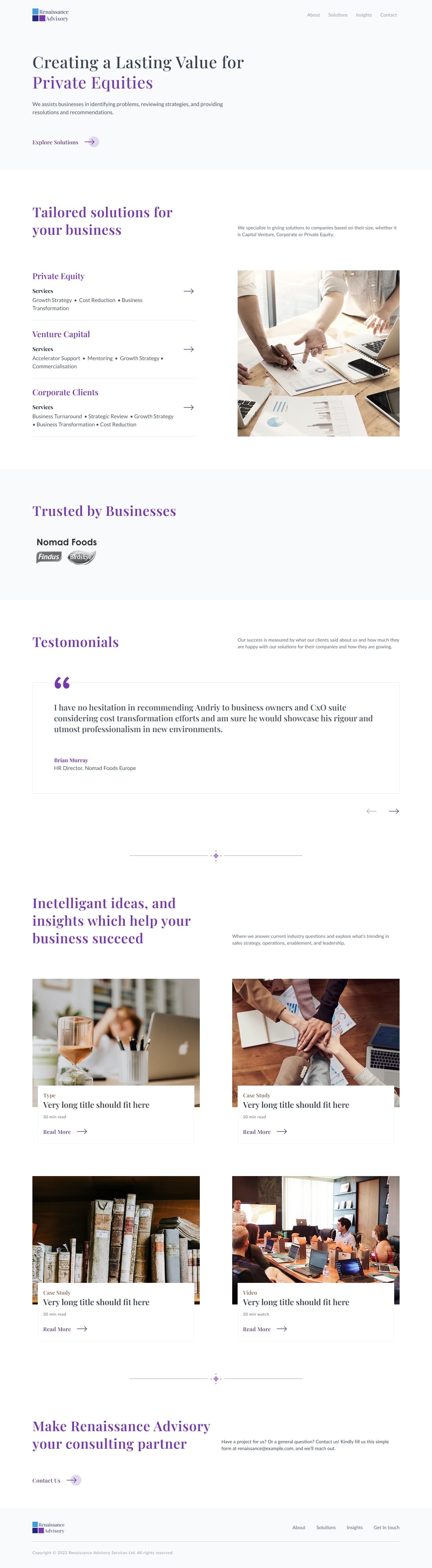
  • renaissance-advisory.com
    Home page

    Home

    Hero promise, the three client types with their service lists, client logos, a testimonial carousel and the insights feed.

    • Hero
    • Solutions preview
    • Testimonials
    • Insights feed
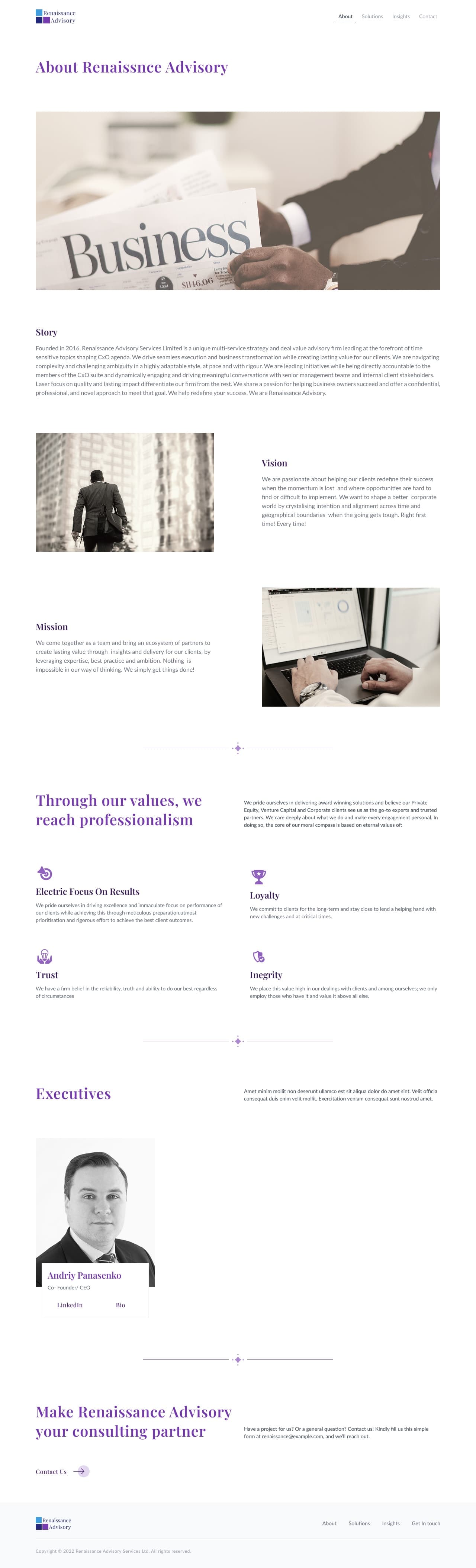
  • /about
    About page

    About

    Story, vision and mission, the four values, and the executive cards that link out to LinkedIn and a full bio.

    • Story
    • Vision & mission
    • Values
    • Executives
  • /solutions
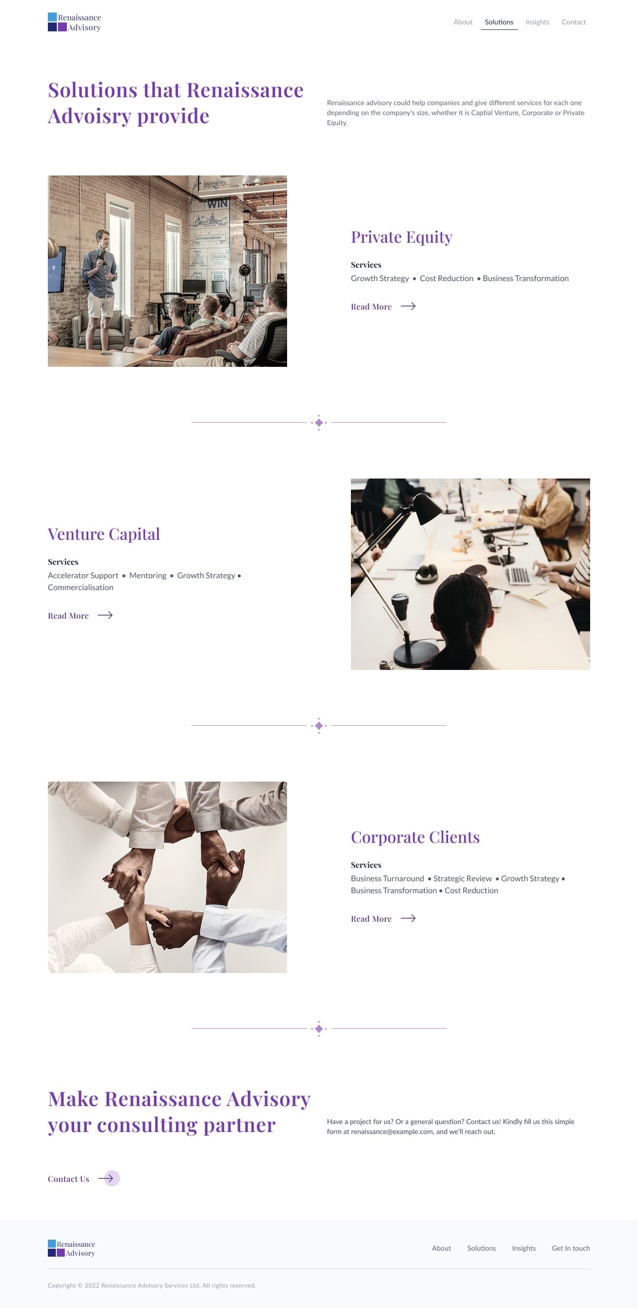
    Solutions page

    Solutions

    The full service catalogue grouped by client type, each row opening into its own solution page.

    • Catalogue
    • Grouped by client
    • Row → detail
  • /solutions/growth-strategy
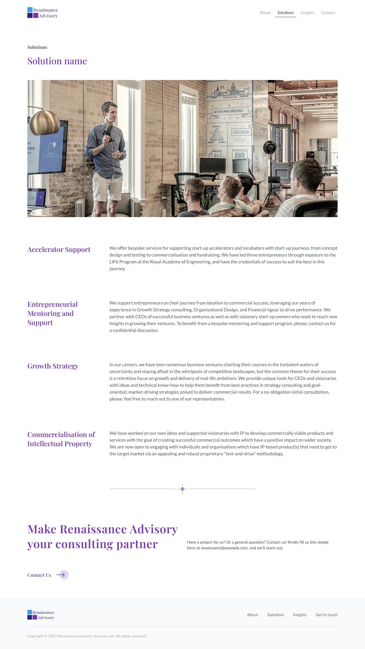
    Solution detail page

    Solution detail

    A single service explained: what it covers, how the engagement runs, and who it is for.

    • Template
    • Long-form
    • Related services
  • /insights
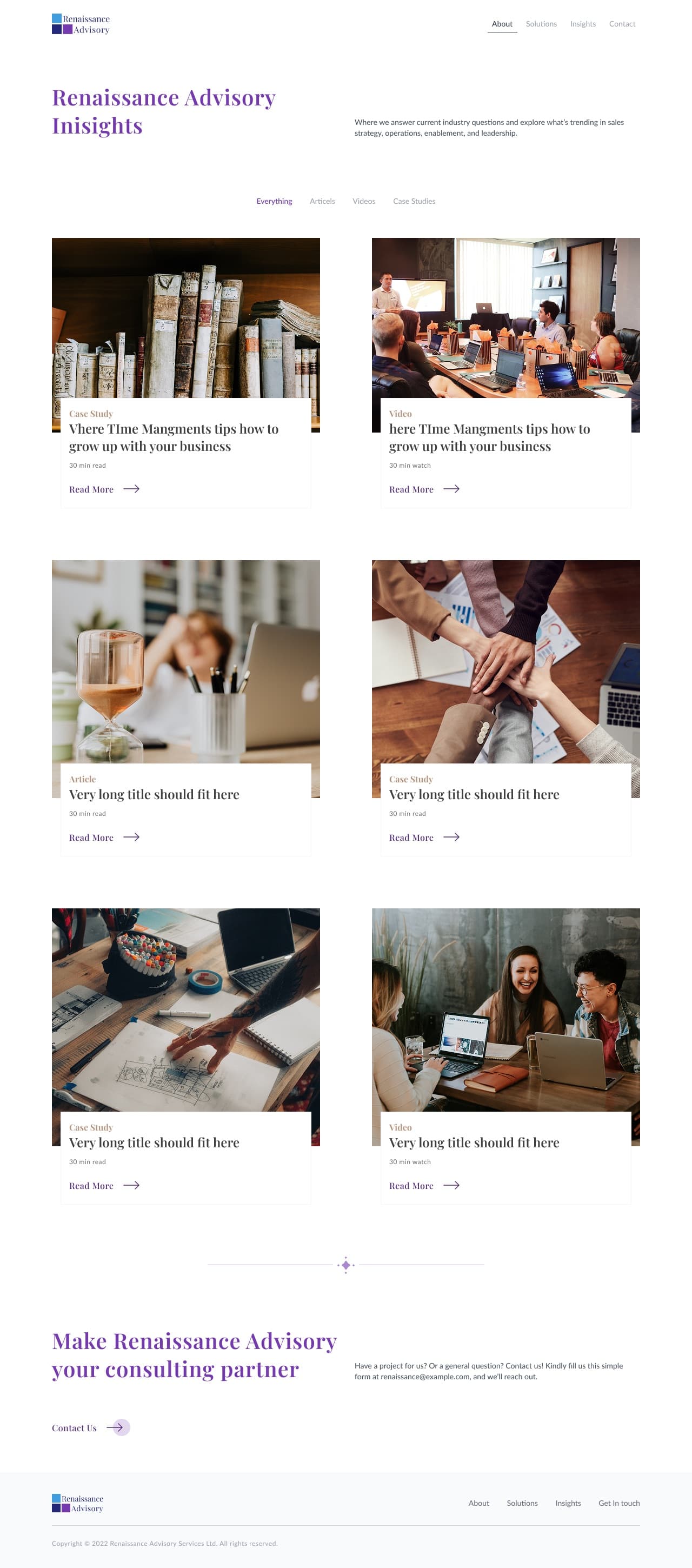
    Insights page

    Insights

    The library index — filterable by content type, with the type label and read time carried on every card.

    • Index
    • Type filter
    • Read time
  • /insights/article
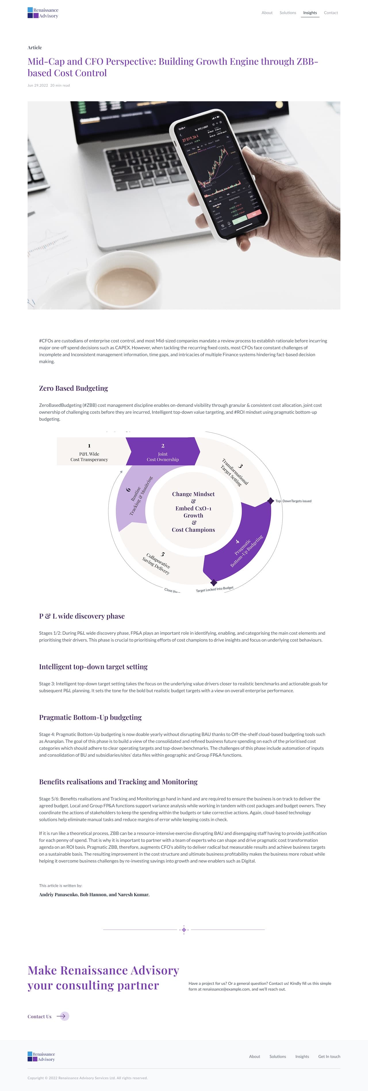
    Article insight page

    Article insight

    Long-form reading template: standfirst, body measure held narrow, pull quotes, author footer.

    • Template
    • Article
    • Author block
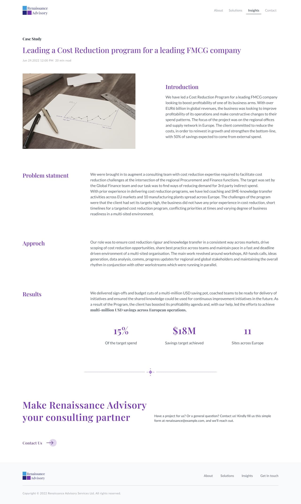
  • /insights/case-study
    Case study insight page

    Case study insight

    Same shell as the article, restructured around the client situation, the work and the outcome.

    • Template
    • Case study
    • Outcome
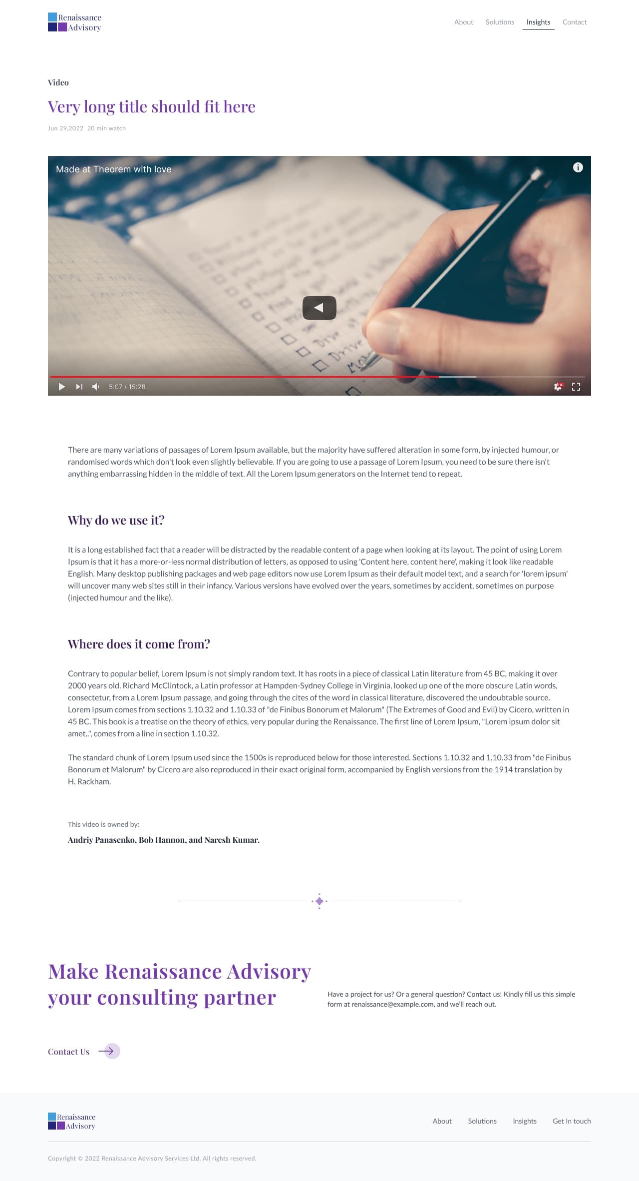
  • /insights/video
    Video insight page

    Video insight

    Video-led variant — player first, transcript and summary beneath, watch time in place of read time.

    • Template
    • Video
    • Watch time
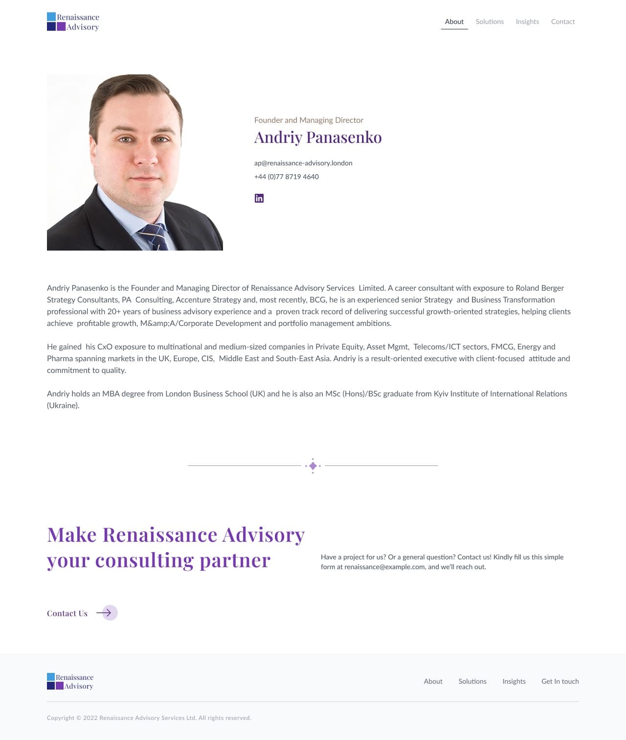
  • /about/andriy-panasenko
    Team member profile page

    Team member profile

    Executive bio reached from the About cards: role, background, focus areas and contact routes.

    • Template
    • Bio
    • Contact routes
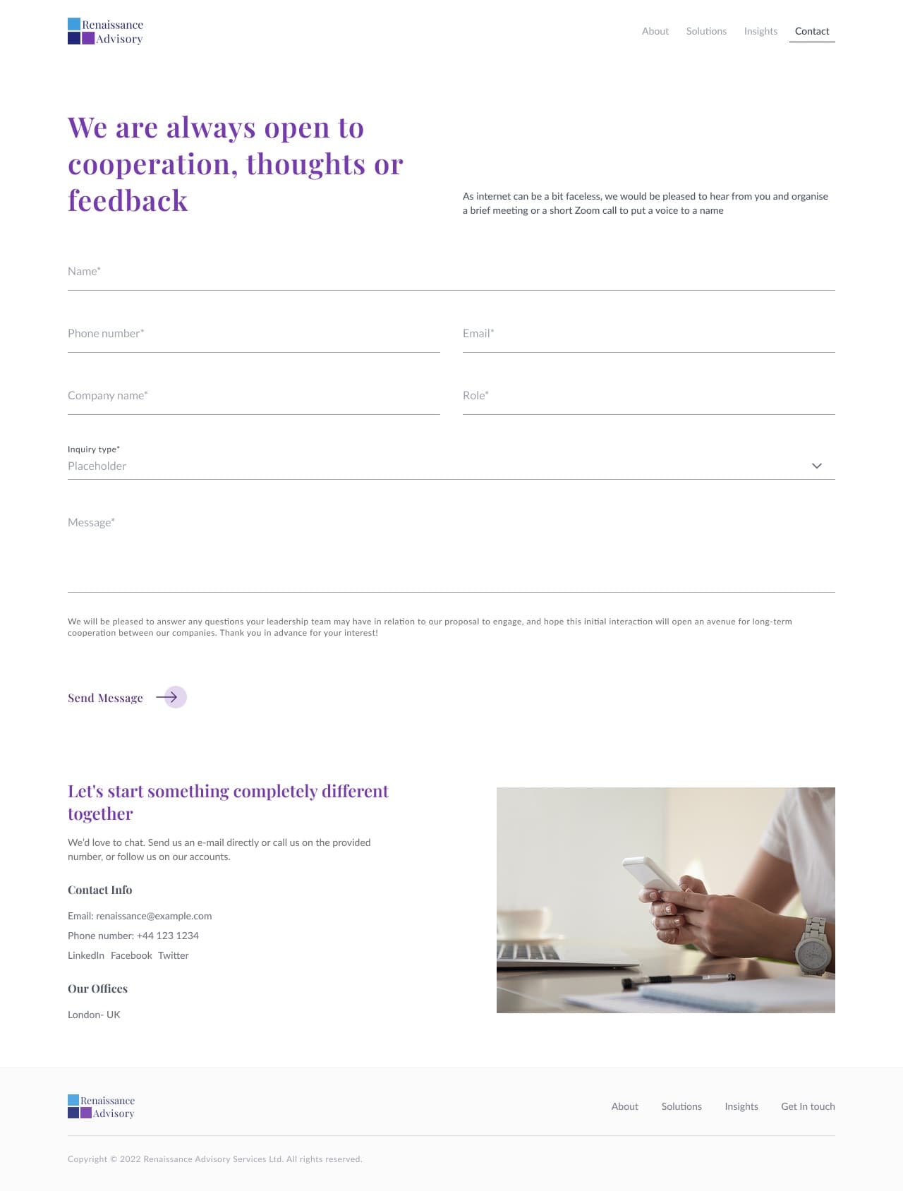
  • /contact
    Contact us page

    Contact us

    The enquiry form with the firm details alongside, matching the contact band that closes every page.

    • Form
    • Validation
    • Firm details
  • /insights?filter=none
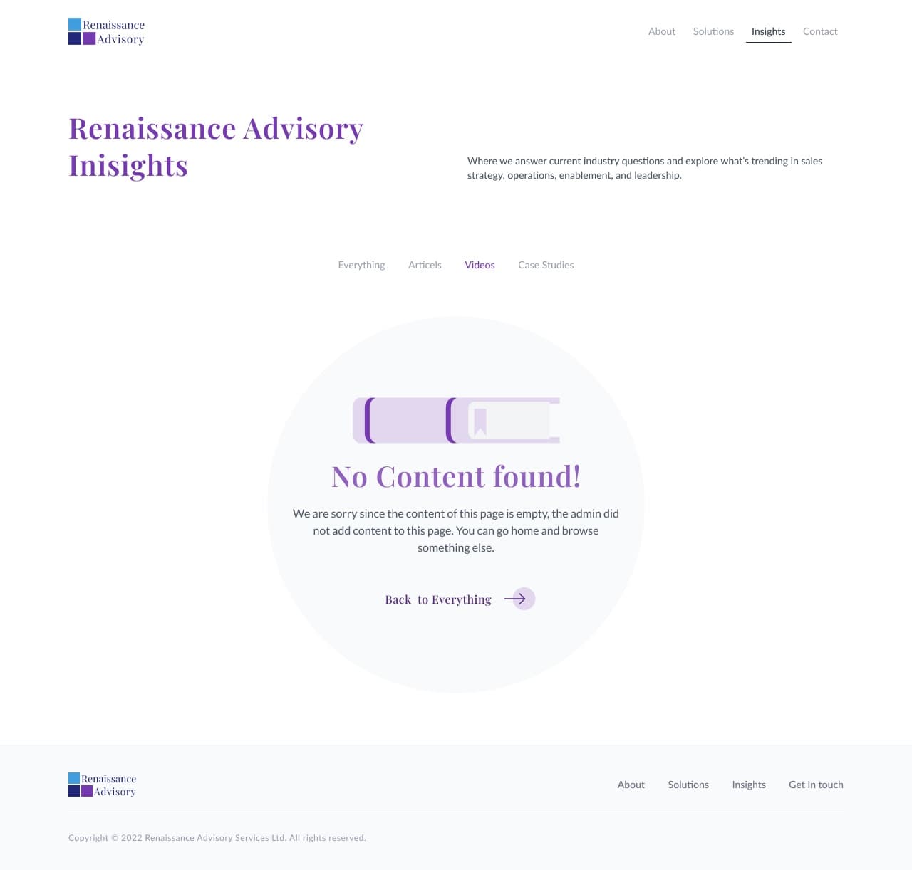
    Empty state page

    Empty state

    Shown when a filter combination returns nothing — explains why and offers the way back.

    • System state
    • Filter
    • Recovery
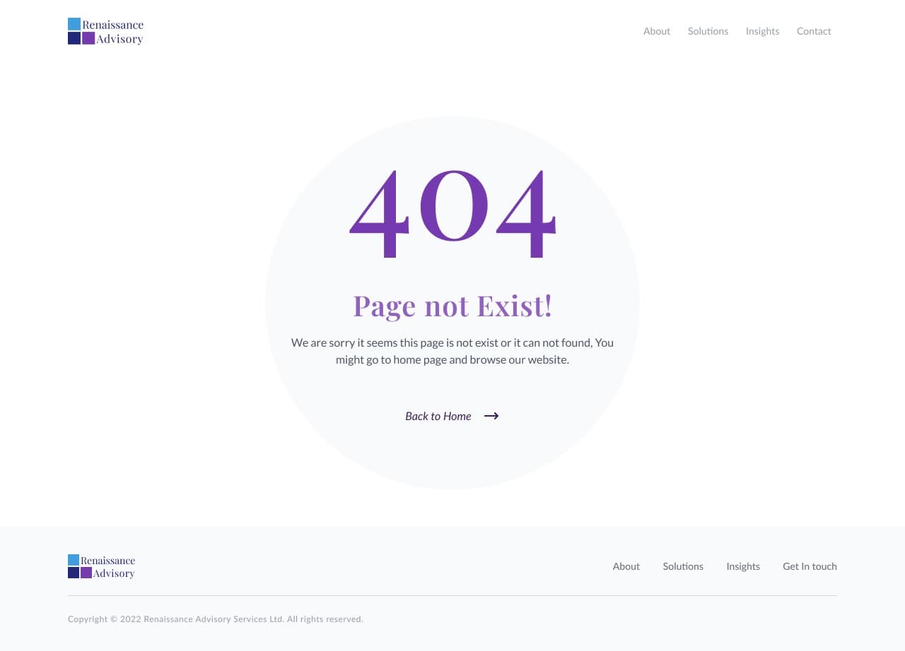
  • /page-not-found
    404 page

    404

    Not-found page kept in the brand voice, routing back to the four primary pages.

    • System state
    • 404
    • Nav out
Process

From research to shipped UI.

  1. Discovery

    Sessions with the founders to pin down the three client types, the service list under each, and the language the firm already uses with clients.

  2. Information architecture

    Four nav pages, five templates, two system states. Every service row resolves to a detail page; every insight resolves to one of three content templates.

  3. Wireframing

    Low-fidelity passes on the home page and the insights index — the two screens where the ordering of sections decides whether the proof lands.

  4. Design system

    Serif and sans pairing, six colour ramps stepped 50–900, and the repeating parts: service rows, insight cards, quote block, contact band.

  5. UI design

    All twelve screens taken to final, including the empty state and 404 so nothing was left to be invented in build.

  6. Handoff

    Specced type styles, colour tokens and component states passed to the developer, with the insight templates documented as CMS layouts.

Results & Scope

What was delivered.

  • 12
    Screens delivered, states included
  • 8
    Text styles in the type system
  • 6
    Colour ramps, 50–900
  • 3
    Reusable insight templates
← Back to all projects